What Is Color Saturation?
Color saturation is the intensity or purity of a color: how far it sits from neutral gray. In CSS, saturation is the middle value in hsl(), where 0% is fully gray and 100% is the maximum saturation for the chosen hue and lightness. How vivid a color looks also depends on that lightness.
More About Saturation
In the HSL color model, colors are described by three components: hue, saturation, and lightness. It's one of several ways CSS can write a color, alongside hex codes and rgb(), and it's the one that treats saturation as its own adjustable value. Each component answers a different question:
- Hue is which color it is: a position on the color wheel, like red, blue, or green.
- Saturation is how pure or intense the color is, from 0% (neutral gray) to 100% (the maximum saturation that hue can reach at its lightness).
- Lightness is how light or dark the color is, from 0% (black) to 100% (white).
Image editors often work in a related model, HSV or HSB, which pairs hue and saturation with "value" or "brightness" instead of lightness. CSS has no HSV notation, so on the web, saturation lives in hsl().
How saturation works in CSS
In hsl(), the middle value is saturation. MDN's hsl() reference puts the scale plainly: 100% is completely saturated, while 0% is completely unsaturated, which is gray. Two colors can share a hue and a lightness and still look nothing alike. hsl(220 100% 50%) is a strong blue. hsl(220 30% 50%) is the same blue hue at the same lightness, but it reads as a muted, grayish slate, because only the saturation changed.
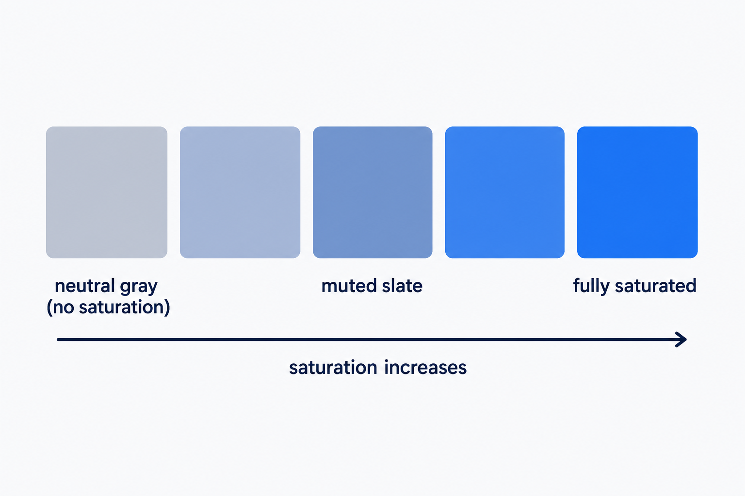
Lightness caps what saturation can deliver. At 0% lightness every color is black, and at 100% it's white, whatever the saturation value says. Even between those extremes, a very light or very dark color stays pastel or murky at 100% saturation, so vividness comes from the saturation and lightness pair, not from saturation alone.
Hex codes like #3366cc store the same colors but don't expose saturation as a number you can edit. That's why designers reach for hsl() when they want to tune it: change one value and the color turns more or less intense while everything else stays put.
When to saturate and when to mute
Use high saturation sparingly, for the one or two elements you want clicked. Buttons and calls to action (CTAs) are the classic cases: a vivid color draws the eye toward them, almost instinctively.
The trick only works against a calmer page. Saturation attracts attention by standing apart from its surroundings, so when every element is saturated, none of them stands out. Keep backgrounds, large surfaces, and text-heavy sections in muted tones, and save the vivid color for the action you want taken.
Saturation isn't legibility, either. Whether text is readable depends on the lightness contrast between it and its background, so check that separately, even for your most vivid colors. For help choosing saturated accents and muted supporting colors that work together, see our guide to building a color palette.
Frequently Asked Questions
Custom Website Design
Get a one-of-a-kind, mobile-friendly website that makes your brand truly shine. Share your vision with us and we'll take it from there.
Custom Web Design